
Today I’d like to talk about something that is not strictly related to development process but that it’s very useful when you are running your company as freelance or entrepreneur or if you are team leader of a team.
One of the most important thing for me when you approach a new technology is not only understand if it could fit all your needs but also understand when you introduce in your team or company how to have the best result as soon as possible.
That’s why I keep always a lot of attention on how to create a flexible and elastic workflow that allow my team to create or modify client side solutions without waste our time.
In last years we rapidly see the grow of an hot topic, strictly related to HTML5 and Javascript, like Responsive Design, so the capability to create an interface that is viewable and usable on different devices (from smartphones to web browsers for instance).
Personally, if I didn’t find anything that help my team to be immediately very productive I usually avoid to introduce new softwares in the actual workflow, but this time we are in the middle of a big revolution where HTML5 and Javascript are the main protagonists.
During last Adobe MAX I saw a couple of interesting demo on Edge “family” and I was impressed on the capability of Edge Reflow and its interaction with Photoshop CC to create user interfaces for different devices in really few time, that’s why I was really waiting to test this feature and I’d like to share with you my first experiment.

Photoshop CC and Edge Reflow
I think a lot of designers create the UI for a project with Photoshop, last Monday (9th September) Adobe released an update of Photoshop CC and Edge Reflow, but we start with Photoshop because the news are really cool.
One of the most boring activity for a designer (or for me when I did it as freelance :D) is to cut all images and prepare assets in different folders for the developers.
Photoshop CC helps us introducing a new feature called Adobe Generator, a new way to automate this long and tedious phase, where the designer has only to follow some simple rules on how to nominate Photoshop levels and the software automatically export all the assets for us, ready to be delivered to the developers team!
For instance if you want to export a particular level as PNG you need only to nominate the level with a PNG extension (for example: “background.png”) and run the new Photoshop command Generate > Image Assets to have all our files ready to be added on the real project.

To know more about Adobe Generator and in particular to know how to set the name of each level I warmly suggest to take a look to Photoshop.com where there are all the information to do that.
Another option that we have (as you can see in the image above) is the capability to export the UI structure and the assets to Edge Reflow.
If you don’t know what is Edge Reflow I explain it in few words.
Edge Reflow is a tool useful to create responsive design layout and, from yesterday, completely integrated with Photoshop CC.
In fact now you can import in Edge Reflow your layout and you can start to customise it visually for any screen resolution your project will work.
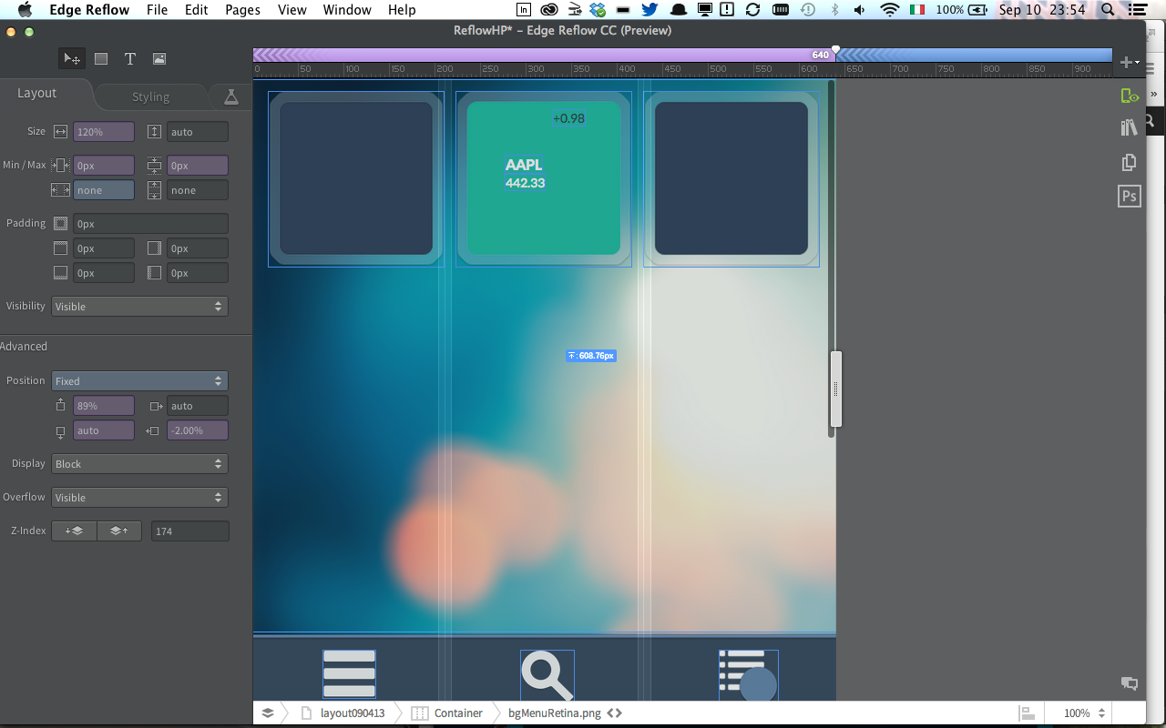
The most interesting thing is that you can export from Photoshop an Edge Reflow project, or you can synchronise in real time the changes when the 2 softwares are open.
Then you can create your layout for different resolutions only copying and paste the code generate from Edge Reflow in your favorite code IDE; I mean copy and paste for now instead of import because probably (at 99%) you’ll have to improve or change it a little bit after paste but it’s really a good step forward for a software in preview like Edge Reflow.
With Edge Reflow you can create <div> adding box elements in your layout and you can show or hide elements present in different screen resolution simply with the options in the left side of the software interface.
Another very cool thing is the capability to work with your Typekit account (integrated in your Creative Cloud subscription) to download the fonts needed in the layout made with Photoshop.
Edge Reflow and Edge Inspect
Last but not least, Edge Reflow is integrated with another cool product of the Edge family called Inspect.
Edge Inspect is a simple application that you can add as plug-in in Chrome or you can download in your iOS or Android device from the relative store, and it allows you to test in real time all the changes you are doing in a website or more in general in HTML, JS or CSS file checking in real time the final result in one or more than one device simultaneously.
This is a capability that partially missed in the flash development workflow where the mobile test was a real pain (in particular the first releases of Adobe AIR on mobile), in this case with all those new technologies Adobe decides to evolve and improve this experience giving good tools to develop.
From a developer perspective
Personally I think that the integration of a technology like Node.JS in last Adobe softwares (Brackets, Adobe Generator, Edge Reflow and so on) is giving a real boost to them, and they are opening new horizons in the desktop application field, in particular I suggest to take a look to Node-Webkit, an open source project that allow you to work with HTML5, Javascript (Node.JS obviously) and WebGL to create desktop application for different platforms.
There are many other tools that could help to achieve the same goal like TideSDK for example, but I think Node-Webkit could be very interesting if the project will be well approach by the community.
Conclusions

Finally the big players on the market are delivering tools that allow us to create engaging and amazing experience with HTML5 and Javascript like other technologies did in the past (Flash Platform in primis).
The combination of Photoshop CC, Adobe Generator, Edge Reflow and Edge Inspect give us a real flexible and integrated workflow where in few steps we can save a lot of hours spent on the code with great results.
Obviously those tools are new and in “preview” so they are not perfect but they are stable and useful enough at this point to be integrated in the actual daily workflow giving immediately importart results.
I really hope this is the first steps to give us the freedom to create instead became crazy to have layouts working in different browsers and devices.


 lucamezzalira.com